The 123's of the Counted
Cross Stitch Alphabet
It is no wonder that counted cross stitch alphabets are some of the most sought-after designs.
You can:
- bring back that "touch of class" by monogramming your best clothing and accessories
- personalize linens to make the ordinary extraordinary
- create heirlooms that announce a baby's birth or celebrate a couple's wedding
- stitch a sampler with designs that depict a lifetime of experiences
- share your favorite poem, verse or saying
It is a simple concept guaranteed to make your cross stitch treasures unique and personal.
If you buy a kit that includes text, the designer usually includes a cross stitch alphabet in the chart. The challenge comes when you're planning a significant overhaul. Not only do you have to find a style that complements the rest of the design, but you have to consider sizing.
- What is the height and width of individual letters?
- How much space do you allow between the letters?
- What about between the lines?
It may seem a bit overwhelming, but trust me, it's easier than you think.
Letter styles
I categorize cross stitch alphabets in three styles:

- line letters--where backstitches create the individual lines,

- block letters--mainly constructed with cross stitches, and

- picture letters--where individual letters are designed with one or more images (for example: where the vertical lines in a letter are made up of crayons). This last category is used most often when the text is the design.
Next, I further sort these alphabets into
- standard/straight--as if you are printing your name, the vertical strokes are at 90 degree angles to the horizontal ones, or

- script/italics--the letters slant to the right, as if you are writing in cursive

Some letter sets have both upper case (capital letters) and lower case, while others use only one or the other.
Although a cross stitch alphabet pattern is stitched in a particular color, it is assumed that you will adjust it to match your personal taste or to coordinate with the accompanying design.
Personal taste plays an important part
Let your own personal taste play a part in selecting a cross stitch alphabet style. If your design is light and delicate, use line letters in script format. When your cross stitch design is bold and weighty, consider straight block letters.
Be certain that your text accentuates, and does not detract from, the overall design. A pattern primarily centered around a favorite verse or saying gives you lots of options. Use letters that help communicate the message--a humorous saying calls for a different alphabet than a sentimental poem.
Click here to find the perfect alphabet design.
How to fit text into a design
There is no specific formula for selecting a cross stitch alphabet that will fit in the space allotted. It is just a matter of getting out your graph paper, pencil and eraser!

To get started, select the graph paper button on the menu to the left of this page to print some blank sheets of graph paper. If you are fitting text into a specific area on a pattern, it is easiest to choose the graph paper with the same number of squares per block shown in your chart.
More often than not, your pattern will be 10 by 10. For width and length, count the number of squares available for stitching, then outline that same area on a piece of blank graph paper.

Considering space in a cross stitch alphabet
If you have little text and lots of space, this will be easy. It's simply a matter of picking a style you like, drawing the letters on the graph paper so you can center it vertically and horizontally, then stitching it.
Not sure if your letters will fit?
- Select the cross stitch alphabet you like most and is most likely to fit. If your stitching area is tall and narrow, select a narrower alphabet so that you do not end up with only a word or two per line.
- On blank graph paper, draw the letters of the longest line of text. At this point, leave a consistent number of spaces between the letters; a few more than that between the words.
- Later in the process, we will adjust the spacing between specific characters for a more appealing look. But right now, we don't want to get bogged down in fine-tuning text that might not fit anyway.
Please Note: Parts of this particular pattern were stitched "over two threads" and others, including the text, were stitched over one. Designers do this in order to provide more detail in some areas.

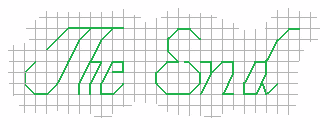
As in this example, if the line of text fits (or nearly fits) horizontally, and you like the way it looks, keep working. Since I like this lettering, I look for ways to eliminate 10 spaces.

Move some letters closer together, and treat the double zeros artistically.

Now it fits! And since my other lines of text are shorter, I have found my alphabet.
Finally, I add a few final touches to the letters.
With only two other lines of text for this pattern, the name and the stats, we'll have no trouble vertically. Just space it in a pleasing arrangement, and you're done.
The ups and downs of alphabets
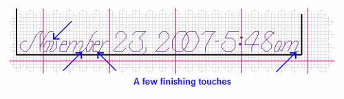
In another design centered around this "Mustard Seed" passage, we also have to find just the right fit vertically. With several lines of text, you have to pay more attention to working around, or with, the ascenders and descenders. As before, print some more graph paper, sharpen your pencil and never forget where you put your eraser!
Start by lining out the text with your chosen alphabet. At this point, leave a space between the descenders from the top line (f, y, f) and the ascenders from the second line (both d's).

Got plenty of room and like this spacing? Map out the rest of the passage and start stitching. But if space is at a premium, let's see how we can squeeze these vertical lines a little tighter.

Gain a couple of lines by simply moving the second line of text, as it is, up one.

Try gaining another line, and the ascenders and descenders start getting in the way. Move "as" to the line above, then try a little creative typesetting.
The "f" descender from the first line meets the "d" ascender from the second. Stitch a small cross in the middle, and carry the "s" down to join the "d" below. Like computer programmers say, "it's not a bug, its a feature."

Another example of making the letters work for you. Carry the "y" from the top line down to form the "s" on the second line. Let the descender from the "f" cross the "t" below it. Tell everyone you did it this way on purpose.
There are lots of ways to not only gain space, but add personality to your cross stitch text.

Think of the chart as a place to start
Consider a cross stitch alphabet pattern as a place to start. From there, find creative ways to alter the letter combinations. Nobody will be comparing your stitched piece to the pattern letters.
Every stitcher is unique, so make sure that the cross stitch keepsakes you create reflect your uniqueness.
And speaking of places to start, take a look at our many free cross stitch alphabets and free cross stitch patterns, varying from simple to complex designs.
Blog
-
Fabric Mounts
Nov 25, 17 08:17 PM
I want to ditch my old split rail frames and stand. I have read about a new product called, Fabric Mounts. It is supposed to keep material taut and aligned -
Hoops are okay
Nov 25, 17 08:15 PM
I've tried them all . I prefer spring hoops but if my hands are weak I have a difficult time squeezing it. The tension is great if you like taut. I NEVER -
Why a hoop????
Nov 25, 17 08:14 PM
I have never used a hoop and have been cross-stitching for 15 years - only because I didn't think it appropriate. Suddenly I came across this article and -
Don't settle for "almost"
Apr 08, 17 01:16 AM
What do you do when you can't find the perfect cross stitch chart? It happens more than you'd think.
Even though we're no longer limited to the patterns we can find in magazines or at the local craft…